About the Health Poverty Index (HPI) tool
The NHS Plan (2000) states that "no injustice is greater than the inequalities in health which scar our nation" and proposes a number of developments to combat this situation. One of these is the production of a Health Poverty Index (HPI). Following the publication of the NHS Plan, The Department of Health (DoH) commissioned a scoping project to develop the HPI concept, involving a major consultation and a series of discussions within the DoH and between the DoH and other bodies charged with tackling the issue of health inequalities.
Work on the HPI development was initially funded by the DoH and subsequently by the NHS Information Centre for health and social care. The work was carried out by the Department of Geography and Geosciences, University of St Andrews, the South East Public Health Observatory (SEPHO), the University of Oxford, and Oxford Consultants for Social Inclusion (OCSI).
The HPI tool
The HPI tool allows groups, differentiated by geography and cultural identity, to be contrasted in terms of their 'health poverty’. A group's 'health poverty' is a combination of both its present state of health and its future health potential or lack of it. The key justification for the selection of a particular set of groups is the expectation of an equal distribution of health and its determinants between the groups in a just society.
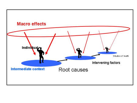
A simple graphical representation of the conceptual framework lying behind the design of the HPI is given below. It illustrates that the situation of health, for a group, can be conceptualised as emerging from a history of intervening factors that are themselves based in a set of root causes. Each of these stages is influenced by the different contexts in which they take place. These can be seen as an immediate individual-household level, a local (intermediate) level and a wider social (macro) scale.

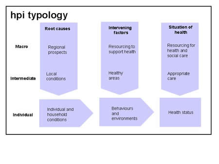
In order to produce an index from the conceptual framework presented above, it is necessary to identify and measure the important elements acting at different points within the framework. It is argued that there are nine main ‘domains’ and these are shown below. For each domain a set of indicators have been developed which aim to capture the significant aspects of the domain as they exist for different groups in society. These indicators are what are shown in the HPI diagrams.

It should be emphasised that neither of the above diagrams are suppose to be explanatory ‘models’. They simply aim to organise the elements that have been proposed within the literature as important in the construction of health inequalities into a form that will aid thinking about policies and actions that might tackle these inequalities. The directions implied by arrows in the diagrams simply stress a natural way of thinking about some of the potential causal flows. They of course do not exemplify all of the complex ways in which the different elements implicated in the production of inequalities interact.
The indicators collected have been scaled in such a way that high numbers represent a situation of high health poverty. For the current tool the main groups are Local Authority Districts (LAD) in England as they existed from April 1st 2001 and ethnic minority groups in those districts. Each indicator has been scaled in reference to scores across all the groups being compared. If two LAs are being compared, they are scaled with reference to all LAs across all time points. If two ethnic groups are being compared then the indicators are scaled across all ethnic groups in all LAs and all LAs at all time points. Thus, for each domain, a score of zero indicates the best situation in terms of health poverty and a score of 1 the worst situation. The data for each indicator has also been ranked, with the ranks then converted to a scale from 0 to 1.
The data are presented in the following formats to allow comparison between the chosen LAD area and the chosen reference group:
- Table of HPI scores for each indicator, chosen area and comparison group
- Bar chart - chosen area in red, comparison group in dark blue (a score of zero indicates the best situation in terms of health poverty and a score of 1 the worst situation)
- Spider diagram (referred to here as the HPI Chart) - chosen area in red, comparison group in dark blue (a score of zero indicates the best situation in terms of health poverty and a score of 1 the worst situation)
The data are presented in the scaled version by default, but it is also possible to view the ranked version by clicking on the ‘Ranked information’ option. The ranked option may be useful where a variable is skewed and therefore it is quite difficult to distinguish the relative position of ethnic groups or LAs that are within the 'main body' of the distribution.
As well as being able to select individual LADs the tool also allows the user to select standard comparative areas based on the ONS area classification scheme listed below:
| ONS Classification of Local Authority Districts |
Super-groups Groups Sub-groups |
The ONS classification groups LADs that are similar in terms of their socio-economic and demographic characteristics. An HPI score has been calculated, a population weighted average score of constituent LAs or ethnic groups in LAs, for each of these groupings of people. This feature allows the score for a group of people in a particular place to be compared to similar places across England.
Variables and data sources
The indicators used in the current visualisation tool come from a variety of sources. For the full list and descriptions of the indicators, see the Indicators page.
Who is on the HPI Project team?
At the University of St Andrews:
Contact us
We are always pleased to respond to any queries about our work. If you would like any further information please contact us:
Lydia Peters
4 Rye Road
Hoddesdon
Hertfordshire
EN11 0HR
United Kingdom
[email protected]
| University of St Andrews | South East Public Health Observatory |
| Oxford Consultants for Social Inclusion | |
Useful links to related websites & online documents
About this site
The development and management of the website and database was carried out by Oxford Consultants for Social Inclusion. The website is based on the open source PHP, MySQL and jpgraph technologies. An important consideration in the design of the tool, was the level of technology available to users. Some users for example, would be using older PCs, running a variety of software and possibly accessing the web via modems. It was important that users in this kind of situation could still access the tool effectively. The site was therefore designed to maximise access rather than to utilise the latest functionality of web browsers. Please send feedback if you have any comments on the design and/or usability of the site.


